
Context
The Interaction Museum is the brainchild of Wendy Mackay's publications Wendy Mackay and Michel-Beaudouin Lafon's publications Michel-Beaudouin Lafon . In 2006 they wanted to build an extensive collection of An interaction technique is “the fusion of input and output, consisting of all software and hardware elements, that provides a way for the user to accomplish a task.” interaction techniques from the HCI research literature. Unfortunately they could not complete and publish the project, despite interest from the research community, as the web was not yet ready for such a media-heavy resource. Ten years later, under the supervision of Wendy & Michel, Isha van Baar and I took on the challenge to design and develop a new, improved Interaction Museum as part of our Master Thesis Internship, within Inria and Universite Paris Saclay.
HCI Researchers & Interaction Techniques
In HCI researchers develop and evaluate interaction techniques to push the boundaries of computer interaction. They then publish them in research papers. Few times, other researchers build upon these methods. Yet it rarely happens for designers outside research to pick them up and implement them in commercial products.
Conformism in Commercial Interfaces
On the other hand, most commercial interfaces (desktop, web & mobile) have largely stayed the same for the past three decades. Windows, Icons, Menus and Pointers (WIMP) with basic Direct manipulation is an interaction style which involves continuous representation of objects of interest direct manipulation functionality (‘drag-and-drop’) are the standard. The main reason for this, is that a good interface for large audiences is one that is easy to understand and Nielsen’s usability heuristics have set the standard for good design for more than 20 years familiar to novices .
The ideal in commercial software is that users only learn a small set of interactions that become standards that any designer can reuse. To support this, designers follow usability guidelines advocated by leading software platforms such as Apple's design guidelines Apple , Google's material design Google , and Microsoft's material design Microsoft . Interface programmers also prefer implementing ready-made interaction techniques from UI Kits (JQuery UI, JavaSwing, etc.).
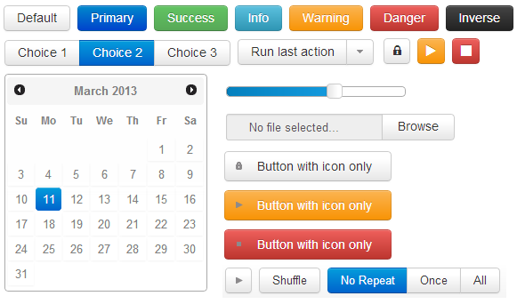
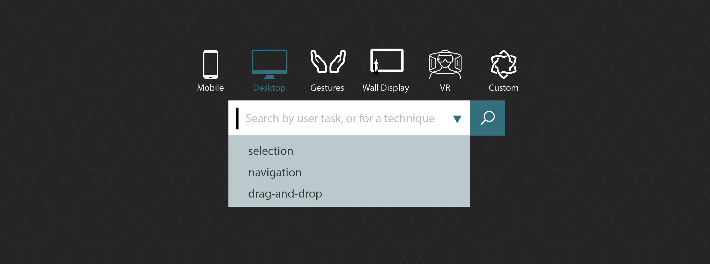
The standard jQuery Widgets, that are used extensively throughout the web
Yet, these standards and guidelines are not always the right solution. Buttons, drop-down menus, switch buttons and drag-and-drop are not always enough to support complex or unusual user tasks. In some cases, it is more appropriate to use custom designed interaction techniques for a specific task or user group.
Design Brief
Wendy & Michel noticed that there is a great pool of unusual, creative interaction techniques in the research field, and a lack of interaction diversity in commercial interfaces. Thus, they wanted to bring the two worlds together, with an online collection of non-standard interaction techniques, called the Interaction Museum.
The Interaction Museum is also envisioned as an active community that maintains and updates this collection, and a content management system that allows members to donate their work to the collection. The scenario bellow visualises how the Interaction Museum was meant to work.

Rose
The HCI Researcher
Rose is fascinated with interaction techniques and has invented a new smartphone gesture called ThumbFlow. She published it in a paper at the UIST Conference.
A day in the life...
Rose used the Interaction Museum when she wrote her paper on ThumbFlow to help her find similar interaction techniques for her literature review. She thinks ThumbFlow is a great invention, as she proved it to be two times faster than standard selection methods for big data sets. She even thought of several use cases as part of common smartphone apps. So now Rose adds her interaction to the Museum, so others can pick it up for their literature reviews, or use it in their products.

Dan
Interaction Designer
Dan is designing a new calendar app. His requirement is to build a date picker that will differentiate his product from all other calendars on the market.
A day in the life...
Dan has been looking at all date pickers he could find. But nothing caught his attention: there's not much variation. He remembers tagging a blog post about a collection of unusual interaction techniques from research literature. He finds the Interaction Museum and stats browsing it. An Exhibition called Selection Methods on Touch Interfaces attracts his attention. There he finds ThumbFlow, which inspires him to build an amazing date picker. His project manager is impressed and users are delighted.
Imagining an Ecosystem
When Isha and I took on this project, we had the freedom to reimagine it. We feared the old concept was out-of-date, so the best place to look for answers was with the users. For that we first had to define who our users might be, and how would they interact with each other.
Our first assumptions about a potential user ecosystem

First Interviews: Debunked Assumptions
To find out if our assumptions about the users were true, we went directly to the source, and we recruited:
- 4 designers
- 3 HCI Researchers
- 3 HCI Professors
- 3 HCI Students
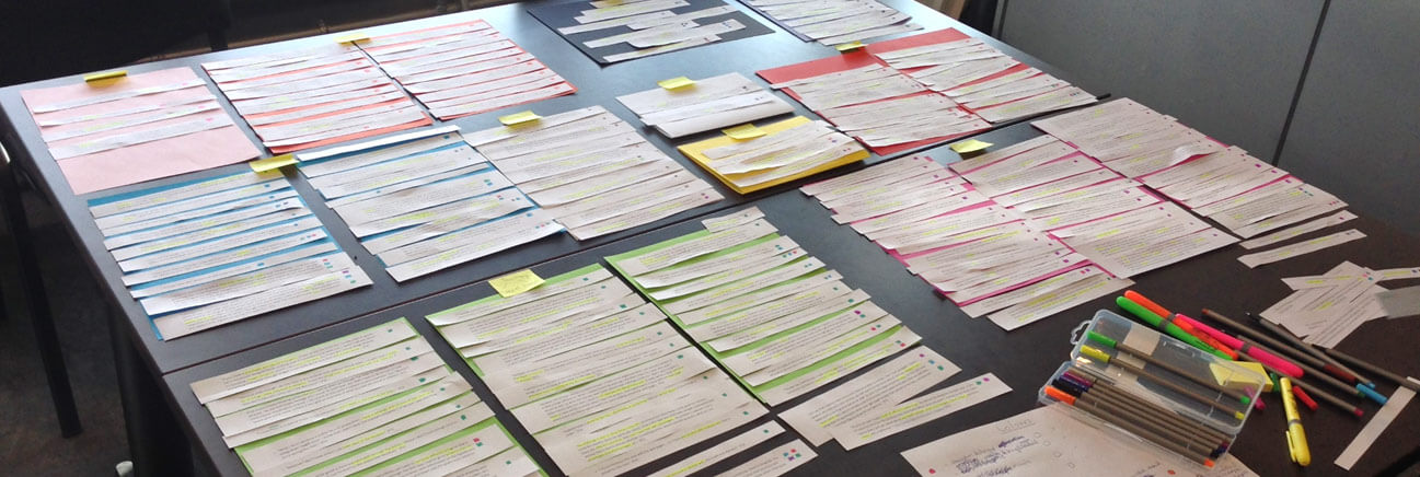
...and we interviewed them about their experience with interaction techniques. After we got the data, we analysed it through an ad-hoc version of imported from social sciences, grounded theory is useful for analysing qualitative data from user interviews. Read more about how it works here. grounded theory analysis grounded theory. As we were still figuring out which are the right questions to ask, and we also had only 3-4 participants of each user group we considered these pilot interviews.
Participant's answers visually calssified into categories.
The most interesting findings were:
Disclaimer: these findings apply only to our interviewees, they cannot be generalized.
- Researchers are motivated by the recognition of their work within research, but they do not necessarily want their work to be used in commercial products
- Researchers don’t like to put extra effort in a published project, to communicate it to others outside research (like adding it to the Interaction Museum)
- Students did not find inherent value in helping the building a collection of interaction techniques
- Designers base their choices on what users already know and they don’t want to design something that developers can’t program
- Designers do not read research articles but look for inspiration in clients’ style, design social media and competitors’ interfaces
- Interaction techniques are hard to communicate and teach, without the use of video or working prototypes
Researching Researchers
Interaction techniques from HCI research are the building bricks of the Interaction Museum. Thus we had to find out more about how researchers create, use and distribute them. For that, we sent out a questionnaire to several research labs and lead researchers.
We got 43 complete responses. 95.3% of respondents were affiliated with a University, and 57% had more than 8 years of experience in the domain.
Findings: Invention & Development
The most common sources of inspiration for interaction techniques
- Observing users (44.5%)
- Exploiting a technology feature (44.5%)
- Improving an existing technique (35.8%)
Researchers mainly develop techniques for:
- Desktop computers (33.3%)
- Custom devices (27.4%)
...but also for tablets (15,6%), smart phones (13,7), tabletops and smart watches.
Only four interaction techniques (out of 38) were developed with web technologies. Java is the most used programming language (31.6%). This denotes a trend in the field, probably due to Java being a common language taught in academia.
Findings: Sharing Interaction Techniques
The most widespread medium to share interaction techniques is research publications (78.9%). Even if interaction techniques are best communicated by dynamic media, only 47.4% of respondents shared videos, and merely 31.6% had interactive demos. We expected that at least few researchers would have had their interaction technique implemented in a commercial product, but none did.
I was satisfied with the response from sharing the interaction technique as a ...
‘Conference presentation’, ‘Video’, and ‘Interactive demo’ outperform all others in the satisfaction to dissatisfaction ratio.
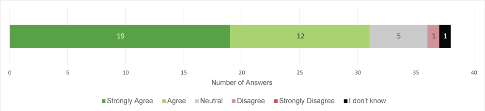
I would like others to use my interaction technique
Researchers generally want others to build on their work, but only 3 got a response from commercial developers.
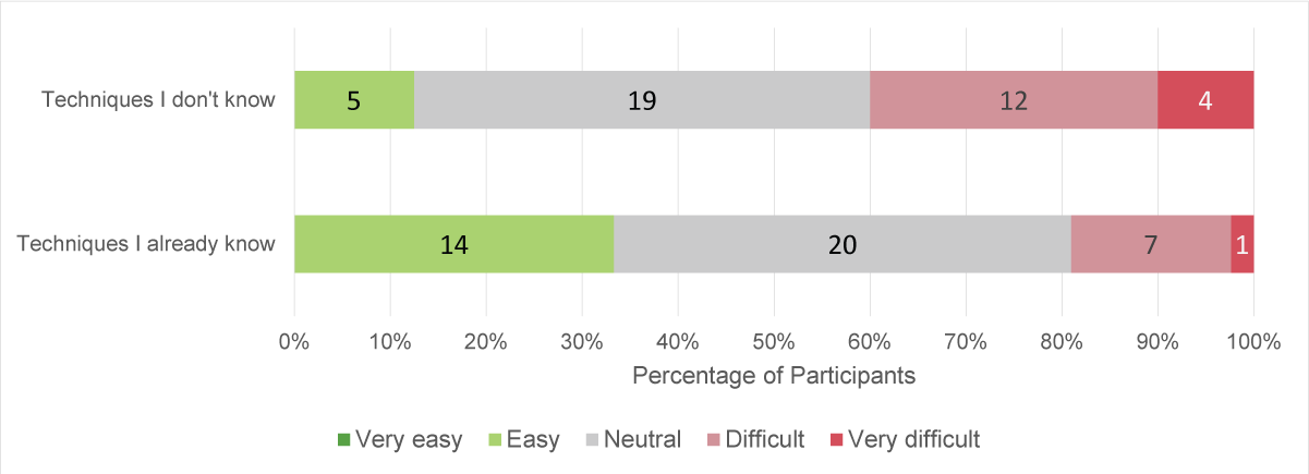
Findings: Finding Interaction Techniques
Most respondents indicated that they look for interaction techniques occasionally, but intensively. This fits with the task of doing a literature review for a research paper.
Finding techniques that they don’t know is a difficult task
Implications for Design
The Interaction Museum should cater to the need of finding interaction techniques easier. For that we need a wide range of techniques linked together by similarity.
Choosing the right media to exhibit interaction techniques in the Interaction Museum has been a great challenge. Through this study, we wanted to find out what media do researchers create for their work, to assess our options. Their answers confirmed our difficulties in finding videos and working prototypes.
Yet, the most disappointing was that very few participants worked with web-based technologies. As the Interaction Museum is web-based, and Java no longer works on major browsers, this leaves us with little hope of exhibiting many working interaction techniques.
How do Interaction Designers Design
We wanted to understand why so many designers choose standard interaction in commercial software. For that we interviewed six designers who work with interactive interfaces. We we used the critical object interview method, pioneered by Wendy Mackay asked them about recent projects they worked on, that contained interaction techniques.
Methodology
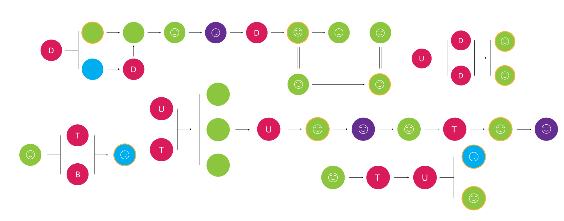
For each interaction technique, I arranged the interview data chronologically in an Similar to Jalal and colleagues’ ‘color portraits’ ‘interaction story’ , containing quotes about the design process and pictures. In total, we gathered examples from 13 projects, in which I identified 20 interaction stories. I then used the grounded theory approach to analyse the data.
To illustrate how categories apply to 'interaction stories' and to get an overview, I conceived a visualisation model.
Story Visualization

Interaction Story
Check out this amazingly creative design studio from Paris Studio Fables participated in a competition to design the French Ministry of Culture’s 2016 digital brochure. Their concept implied a long picture that the users could scroll horizontally.

The design started with a user constraint (![]() ) - the interaction had to be discoverable for non-tech savvy users. This triggered a design constraint (
) - the interaction had to be discoverable for non-tech savvy users. This triggered a design constraint (![]() ) - the best solution would avoid “pressing on the phone”. So their solution was using the gyroscope to detect any tilt of the phone, which would trigger the long image to be scrolled (
) - the best solution would avoid “pressing on the phone”. So their solution was using the gyroscope to detect any tilt of the phone, which would trigger the long image to be scrolled (![]() ). I categorised this solution as non-standard.
). I categorised this solution as non-standard.
When implementing the technique, they identified another design constraint (![]() ):
):
you don’t see in front of you the picture (when you tilt the phone), and if there’s light outside, you can’t even see the screen
”To solve this issue they got another idea, inspired from a metaphor (![]() ):
):
[we wanted to have] the user in the middle of culture, so you move around yourself to discover all the people working in culture
”Yet, once they implemented this solution they encountered two technological constraints: it was not working on older devices (![]() ) and it kept breaking down (
) and it kept breaking down (![]() ):
):
[It was] complicated [to implement] because we are not developers
”Due to these constraints, they finally decided to go with a standard image slider, which the user had to interact with by swiping (![]() ). The designer wasn't satisfied (
). The designer wasn't satisfied (![]() ) with the final solution:
) with the final solution:
in terms of interaction, it was not the most interesting
”Category: Design Solutions
All our interviewees had a highly iterative design process. Before a final version, designers have prototyped and discarded many versions and alternatives. I looked at how these solutions evolved, what influenced them and why did some solutions get discarded.
Design Solutions
Category Dimensions
Standard
a solution that is by default implemented in a majority of similar systems
Non-standard
a solution is that is less common or completely unique
Released
a solution adopted in the final product
Discarded
a solution abandoned along the design process
Satisfied
the designer is satisfied with the solution
Neutral
the designer expressed no particular feelings towards the solution
Dissapointed
the designer was dissapointed with the solution
We deliberately recruited very creative designers, so it came as no surprise that 4/6 explored non-standard interaction techniques. Actually, we gathered 16 (out of 20) stories in which designers explored at least one non-standard solution.
Almost 2/3 of non-standard alternatives end up discarded, as opposed to one-half of the standard ones.

Out of the 20 interaction stories in:
- 13 designers worked with
desktop computers & mobile phones
common devices - 7 designers worked with
a gestures triggered harp, a wall-sized display, a custom device with nine buttons, and a custom tablet built before the iPad
uncommon devices
Surprisingly, when designing for common devices, designers experimented with non-standard interaction techniques almost as much as with standard ones. Yet, non-standard techniques didn't necessarily make it in the released version.

Designers were more satisfied with non-standard solutions they designed, than with standard ones. An explanation could be the Read more about the IKEA effect IKEA effect cognitive bias : people value artefacts they build themselves more than products that are ready-made.

Constraits
In this study, a constraint is a challenge or limitation the designers faced.
Category: Constraints
Category Dimensions
Pivotal
it triggered a new design alternative
Inconsequential
it didn’t affect the design solution
Type
Design
considerations on how the user experiences the product e.g. discoverability
Technical
breakdowns that depend on limitations of software, hardware, and programming skills
User-related
characteristics of target users that shape design considerations
Business
decisions taken by clients or project managers
Time
limitations imposed by deadlines
Category: User Feedback
The designers we interviewed were very sensitive to user feedback. In four cases, negative user feedback led to new design constraints, which triggered their design to change from a non-standard solution to a standard one.
When do designers design non-standard solutions?
Most times, desigers built non-standard solutions because of the uncommon technology they worked with. The second most influencing factor was the desire to delight the user. As one participant noted:
“There’s always a more traditional, and not delightful way to do something, but it’s better if we’re bringing something new to the user
”When are standard solutions chosen over non-standard ones?
There were three interaction stories in which designers started by building a non-standard solution, but in the end they had to re-design a standard alternative for the final product

The most common reason why a non-standard interaction technique wasn't implemented was because of a technical constraint (4 cases). Implementing a non-standard technique is much harder than a standard solution, that can be found in a UI Kit. One designer said:
“Using something that's built-in, it's a 5-second work, build something, even if it's a simple button, it is about 5 days of work, if you build it on your own, from scratch
”Other common reasons for abandoning non-standard solutions are:
- User Feedback,
- User Constraints
- Discoverability
These three go hand in hand: designers tested their non-standard technique with users, and found a new user constraint, so they had to change their design accordingly. As one interviewee said:
“Users don't want to make the effort to discover a new experience every time they try something new. So they are very happy with sticking to what they know already
”Correcting Assumptions
Initially, we assumed that commercial software doesn’t have many custom built interaction techniques because designers don't have access to inspiring examples. Yet none of the stories of this study indicated that. On the contrary, designers did try out creative solutions, but user feedback and design, technical and user constraints persuaded them to choose standard solutions.
As we did this study towards the end of the internship, we did not have the time to implement the necessary changes in the Interaction Museum
Implications for Design
To support interaction designers in creating non-standard interaction techniques, the Interaction Museum should provide resources to help with the technical implementation of the technique.
Designers are also attracted by delightful interaction. Thus, to cater to them, the Interaction Museum needs to present its content in a visually pleasing way.
Generative Design Cycle
During this project, Isha and I have gone through the Generative Design Cycle five times. Each cycle we gathered user feedback, re-defined the design space, improved previous prototypes, and evaluated the system.
The Generative Design Cycle is a visualization of the design process proposed by Wendy Mackay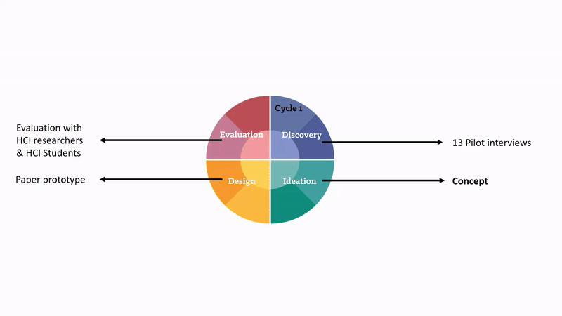
Paper Prototyping
After gathering initial user insights, we defined our design space and prototyped on paper. We started with paper prototypes because they are the easiest to change and iterate on. We didn’t want to get stuck on one idea before we explored alternatives.
Video Prototype on how the Interaction Museum would work.
Video Prototype on how adding a new technique would work
Web Prototype
The next four iterations have been directly on the web. We used Kirby is a file based CMS Kirby as a Content Management System.
To check out the final working website, click here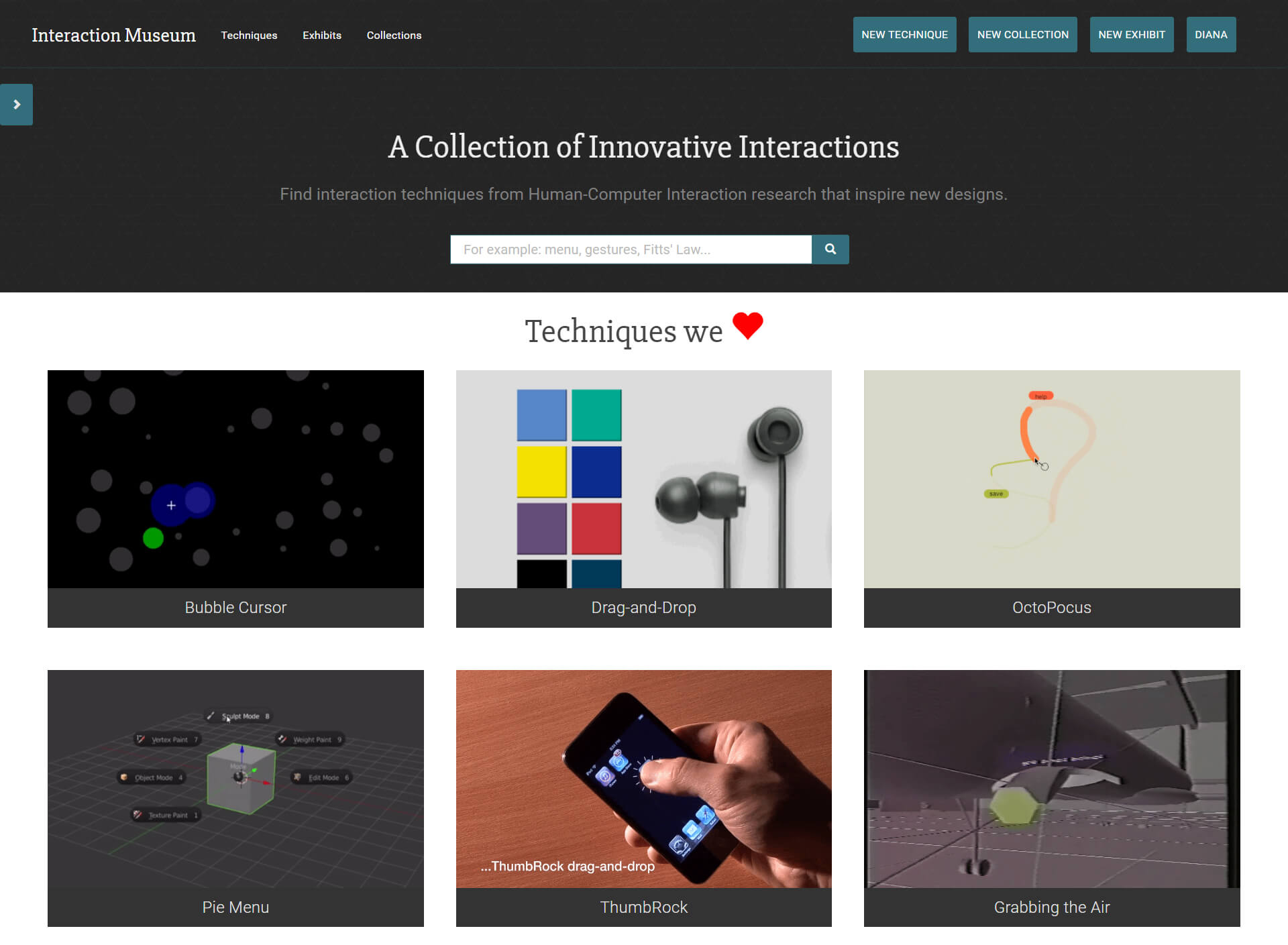
Design Challenges
1. The basic unit
One of the first challenges we faced was deciding what the smallest unit of the Museum is - the interaction technique. There is no agreed upon taxonomy of interaction techniques, nor an encompassing definition.
Is multi-touch interaction the smallest unit, or is it swiping? Should swiping left be a different entry from swiping right? Having a strict rule of what the basic unit is would have made it difficult for contributors. So we decided to let them choose what they believe the basic unit is.
2. Ain’t nobody got time for that
One of the biggest issues with the initial, 2006 Interaction Museum, was the amount of required media for one technique. Many details were mandatory to have a comprehending understanding of how a technique works:
- Long & short descriptions
- Storyboards
- Videos
- Images
- Technical descriptions
- Working prototype
- Related Literature
- Related Interaction Techniques
But as we found out in our study, researchers rarely create all these artefacts when building an interaction technique. Also, after they publish a paper, researchers don’t want to take the time to complete such a long form.
So we decided to just require few elements, such as a title, an image, a short description and tags. The rest were optional, for those who had the time. Even so, adding a comprehesive entry still took a lot of time.
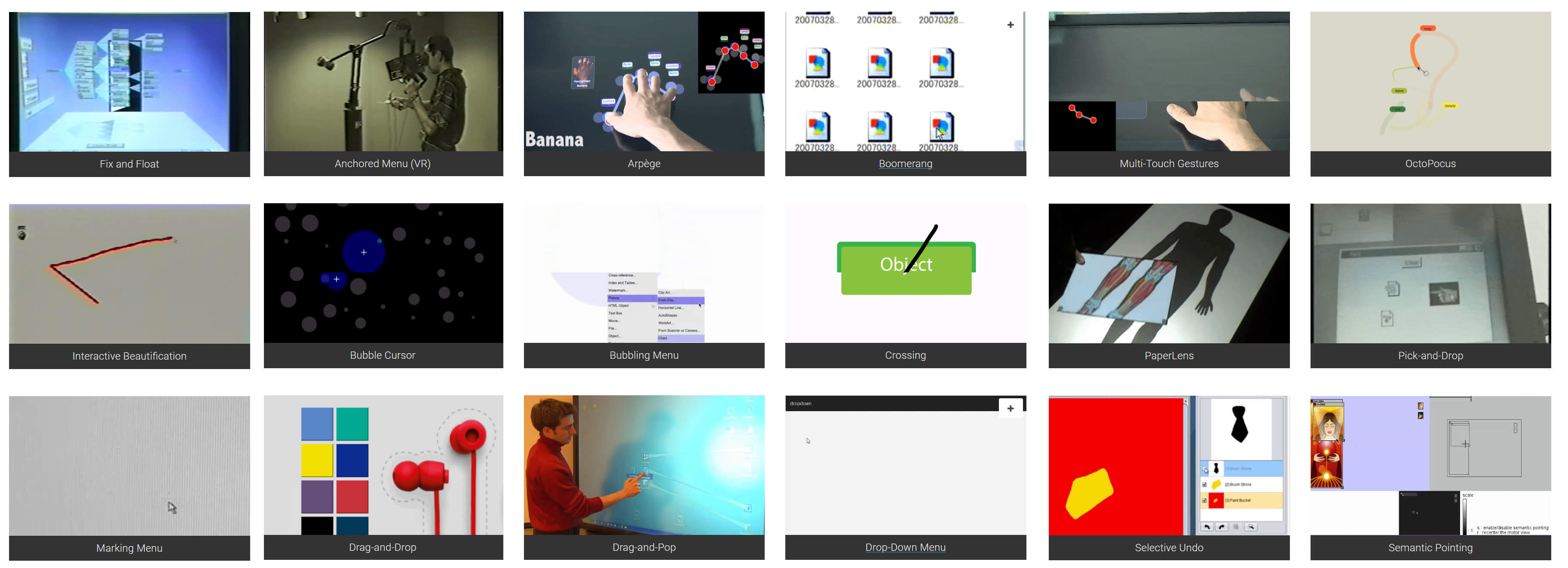
3. Visualising interaction
As interaction is happening in time, visualising it only with still images was insufficient. For that we turned to GIFs - short repeating animations that are perfect to represent at a glance what an interaction technique does.

4. The issue with taxonomies
Once we had a bunch of interaction techniques in the Museum, we needed some sort of categorisation. Yet, we didn’t want to impose a taxonomy, as that could divide and confuse our researcher user base. Moreover, there’s no taxonomy that could accommodate every existing interaction technique.
Thus we implemented 'collections': a way to gather any group of interaction techniques, as the user sees fit. This way, we hoped that eventually a natural taxonomy will emerge.
Evaluation
Even if we’ve done smaller evaluations along the design process, the most interesting one was showing the museum to interaction designers. We didn’t particularly want to conduct a usability test, but more of a concept evaluation.
Out of our five interviewees:
- One designer expressed a desire to use the Interaction Museum in his work.
- Other three thought it was too ‘far away’ from their
They worked only on desktop and mobile. At that time, the museum had a lot of gestural and VR techniques
usual projects - Three thought it had potential, but was not ‘there yet’
We also found several usability issues, but one of the most striking was the lack of a good way to start exploring the museum. The most requested feature was a filter functionality.
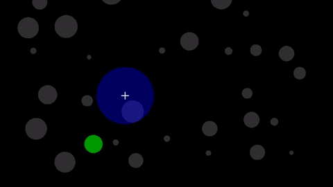
This is my proposed design for a filter function. We didn't have time to implement it.
The feedback we got for the Interaction Museum was disappointing. The issue with mainstream technology, such as desktops and mobiles, is that strong standards rule. Changing those standards would require a paradigm shift, and no collection of inspirational examples can do that on its own.
Even if interaction designers seemed like the natural target audience, we should have focused even further, on designers working on Such as VR, AR, IoT, smart robots. Click more to see Gartner's 2016 Hype Cycle new technology that is in the hype cyle spotlight . They, together with researchers, can create the community the Interaction Museum needs to thrive.
Retrospective & Lessons Learned
In the end, the Interaction Museum wasn’t officially released by the time Isha and I finished the internship. The web app was buggy, and we didn’t manage to collect enough interaction techniques. Michel and Wendy undertook again the project, and looked forward to assigning new interns to push it further.
Nonetheless, what we left behind was
- a working app,
- a clear concept,
- user studies that future decisions can be based upon,
- a lot of documentation,
- and two satisfied supervisors.
I learned how to conduct proper user studies, to analyse the data, present it and to build a theory on top of it. I also learned how to deal with projects in their infancy: taking them from mere concepts to actual realities.
But what affected me the most, in my practice as a designer, was being exposed to all these creative and uncommon ways of designing human computer interaction. Now I know that whenever I will sit down to design a new product, I will look beyond design standards and UI Kits, to better ways, shaped by target users and their tasks.