Train travel is beautiful and filled with adventures. But sometimes things don't go quite as you wanted them to: the train is delayed, and you don't know why, or how long it will last. Or maybe you're in a new train station and you don't know which platform to go to.
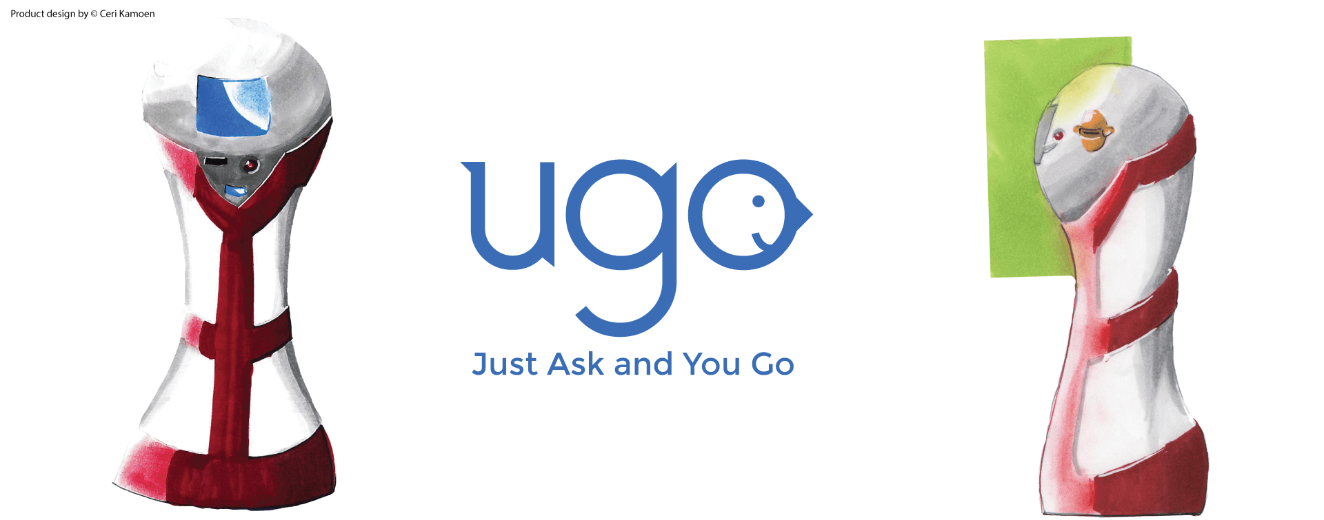
For that, ugo is the solution. Ugo is a friendly assistant placed at different key points in a train station. With ugo, you can scan your ticket, and get clear information about your journey, or any other detail that may affect your travel, such as delays.
Hackathon Project
3 days
UX Design, User Research, Prototyping, Front-End
James Singleton, Sille Kamoen, Hanlin Xu
Out of all the hackathons I know, Check out more about HackTrain HackTrain was the most epic and well organised ever. It started in the UK, with the support of railway companies that needed revival through innovation and new perspectives. For that, more than 100 enthusiasts (programmers, designers and hustlers) met in London, to team up and develop new ideas on the course multiple train rides across the country.
The perfect team: Sille & James - awesome programmers, Hanlin - the business dev, me - the UX designer
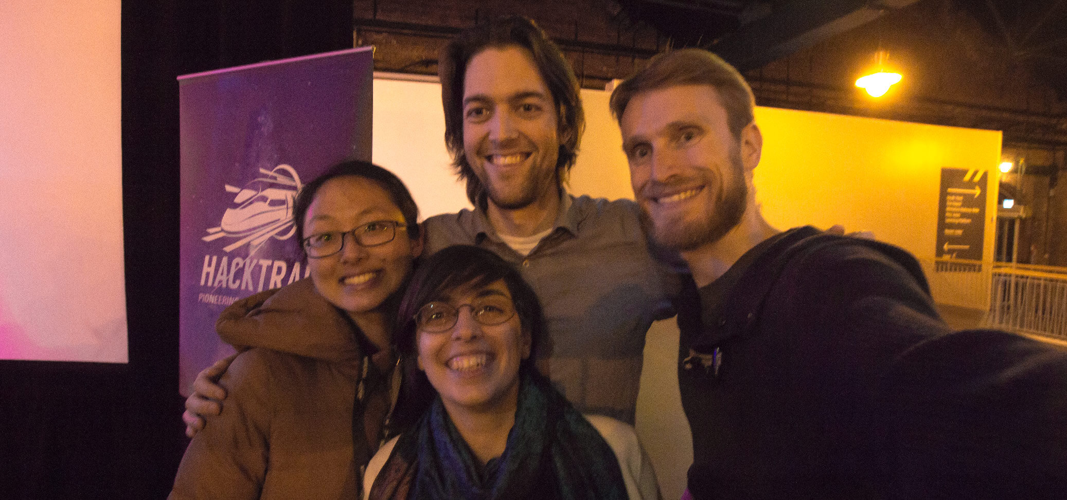
My team united under the idea of building a contextual info point, which offers the info you need, when you need it. We thus undertook the challenge submitted by the At that time, Clair Perry Rail Minister - offering better support and information to disrupted travellers.
As soon as we boarded our first train, we went out and interviewed five fellow passengers, to find out the issues they face. We used the More about the Critical incident technique and how to use it for UX, click here critical incident technique and asked them about the last time they experienced a disruption, when travelling by train.
That night we sat together and defined our proposal. To do that, we clarified what problem we are trying to solve.
When a train is delayed, infrequent travellers are affected the most:
Thus the idea of ugo emerged. ugo is a digital information point, consisting of a touch screen and a ticket reader. There are several ugos in each train station: one on each platform, and a few others in waiting spaces.
ugos possible placement in Newcastle train station

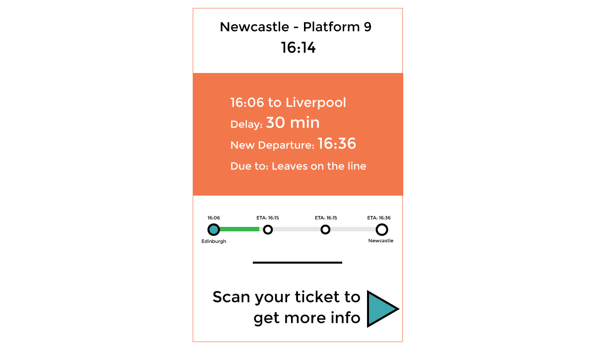
When idle, an ugo contains information specific to its location. For example, if it’s on a platform, it shows info about the next train:
This ugo is placed on platform 9 in Newcastle train stration. It awaits a train that goes to Liverpool and has been delayed.
But the real power of ugo stays in its ability to offer personalized info to any passenger. Just scan your ticket, and you will get:
You have scanned your ticket to find out how to continue your journey, after your train has been cancelled.
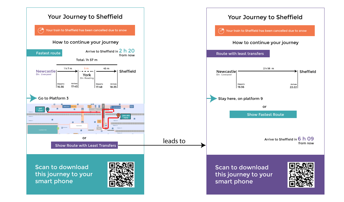
As opposed to a smartphone app that calculates your journey, ugo is always there:
While in Newcastle, we went out in the train station, to get user validation by testing a paper prototype of our concept.
Testing the paper prototype with passengers waiting for their rides
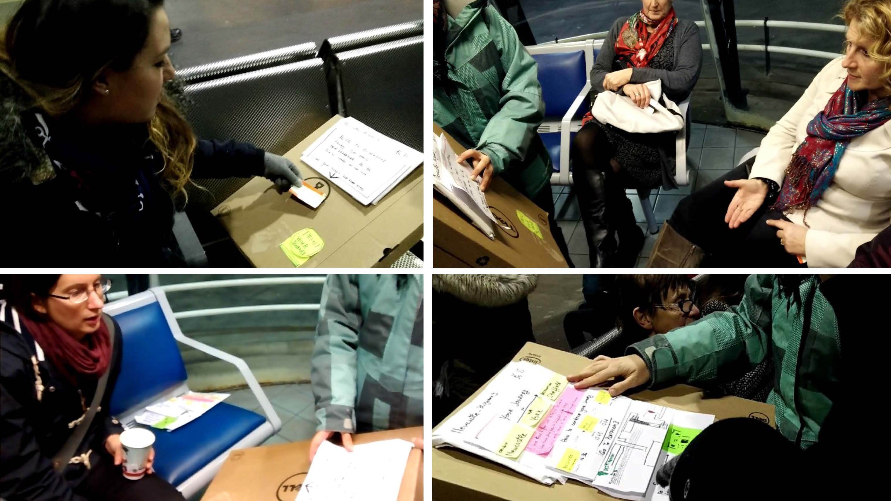
Out of the ten participants, most of them loved the idea of ugo. Yet, three mentioned they prefer asking the train station personnel, even if it meant queuing for it. These users mentioned they are not used to interacting with such technology.
The team's programmers also implemented a fully working prototype, with a smart-phone as a ticket scanner and a iPad as the interface. It worked though web technology, by querying the official train data API.
Working with talented colleagues and surrounded by motivated professionals made Hacktrain an overall amazing experience. It was also great to travel around the UK by train, and learn about the real experiences of train travellers. I was rewarded for my efforts to build an user-centred product with the mention of ‘Best Designer’ of my train.
Even if ugo didn't win the competition, it was highly appreciated by the hackathon organisers. Some investors also approached us for future opportunities, but what they wanted was an app, not a physical information point.
Yet, we did not change our proposal, because, as argued earlier, it would not really solve the problems of disrupted travellers with no access or a phone. Ultimately, what mattered was that we created a product concept that is useful to travellers, even if impractical to railways companies.
Check out CleverKon, another hackathon experience. Spoiler alert: this time my team won :)